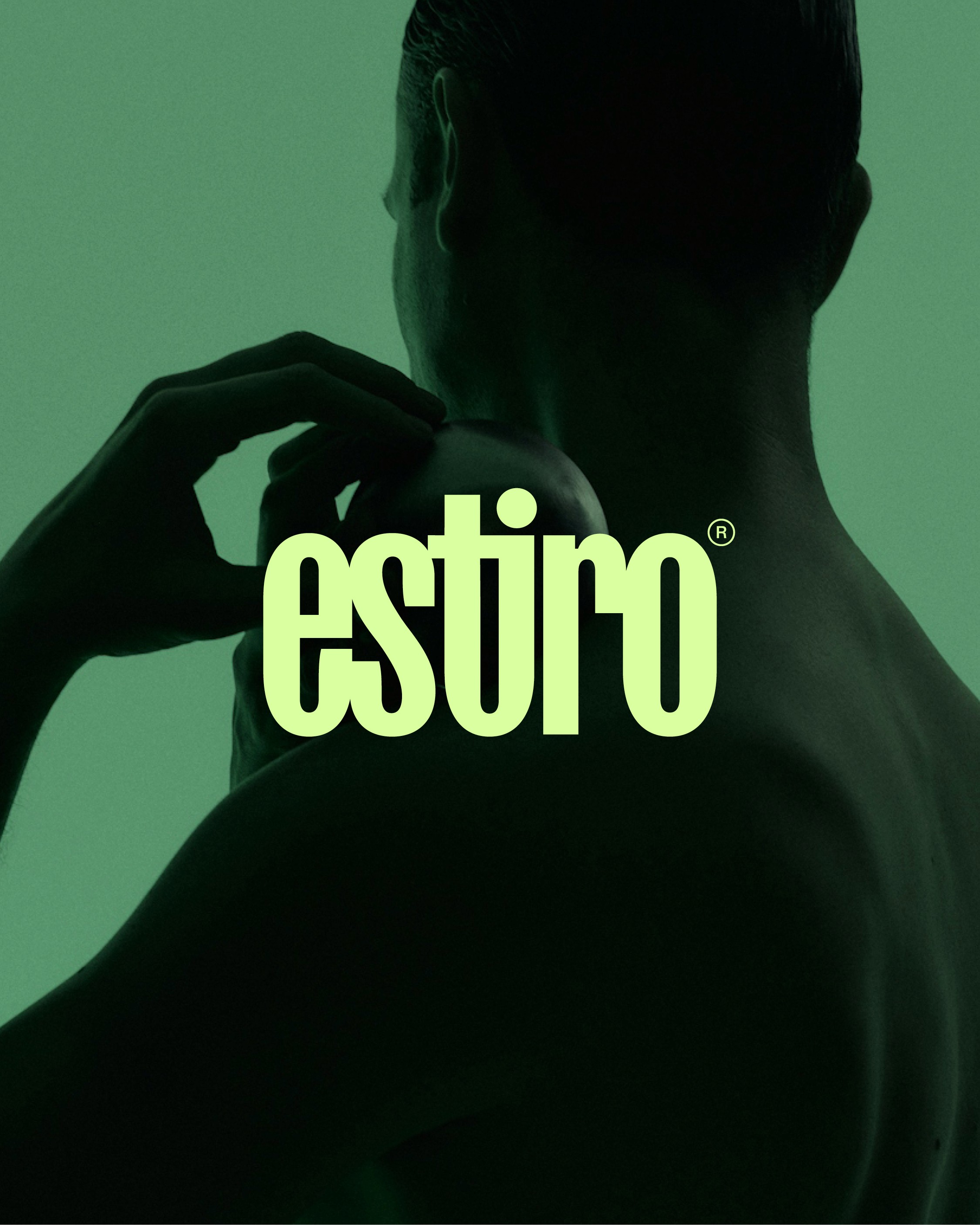
Estiro is a stretching and mobility studio in Madrid. I built the brand from nothing: I created the name, developed the brand platform and conceived the core identity idea — fusing the t and the i into the brand's symbol — then directed a graphic designer through execution, from logotype to applications, colour palette, tone and voice.
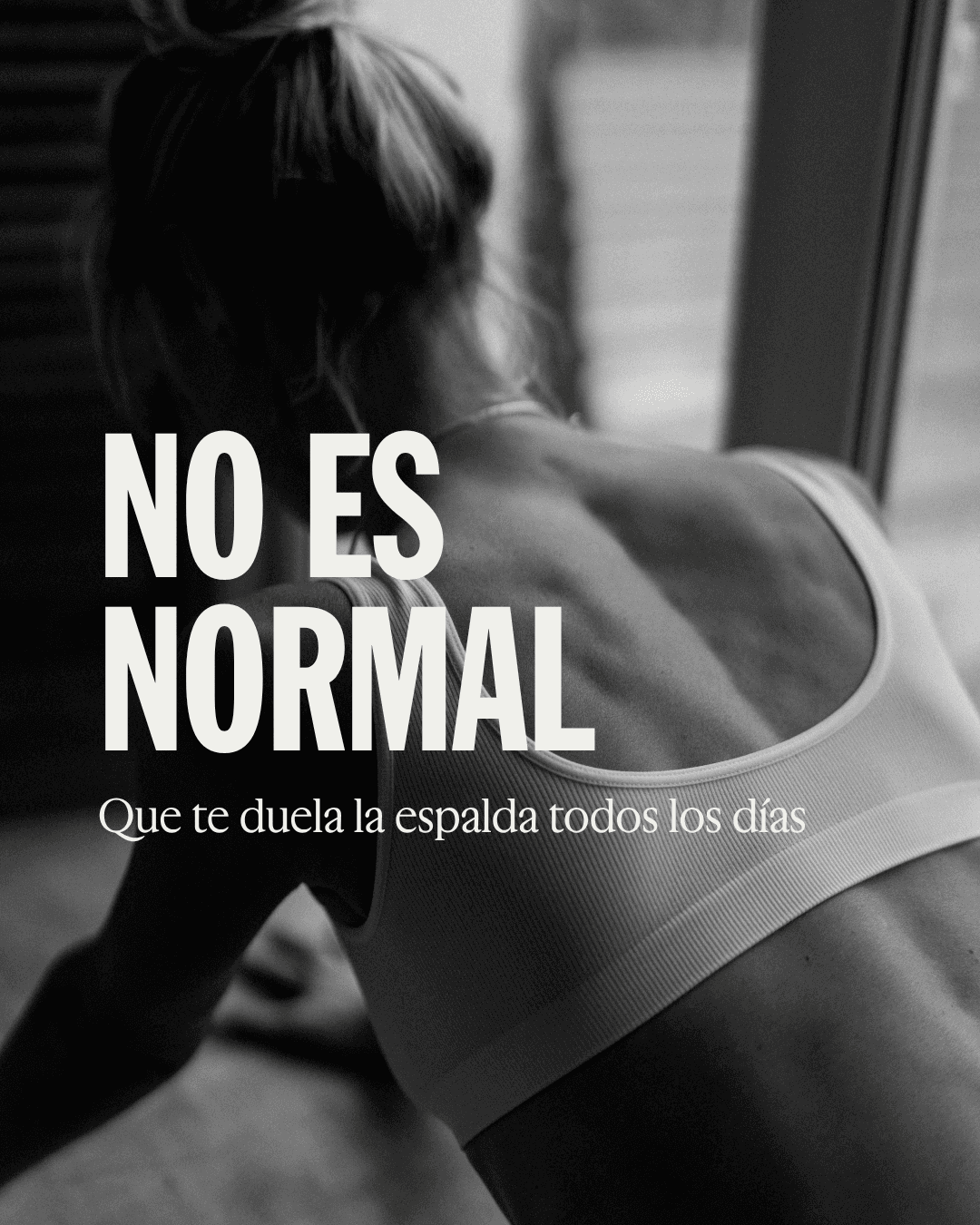
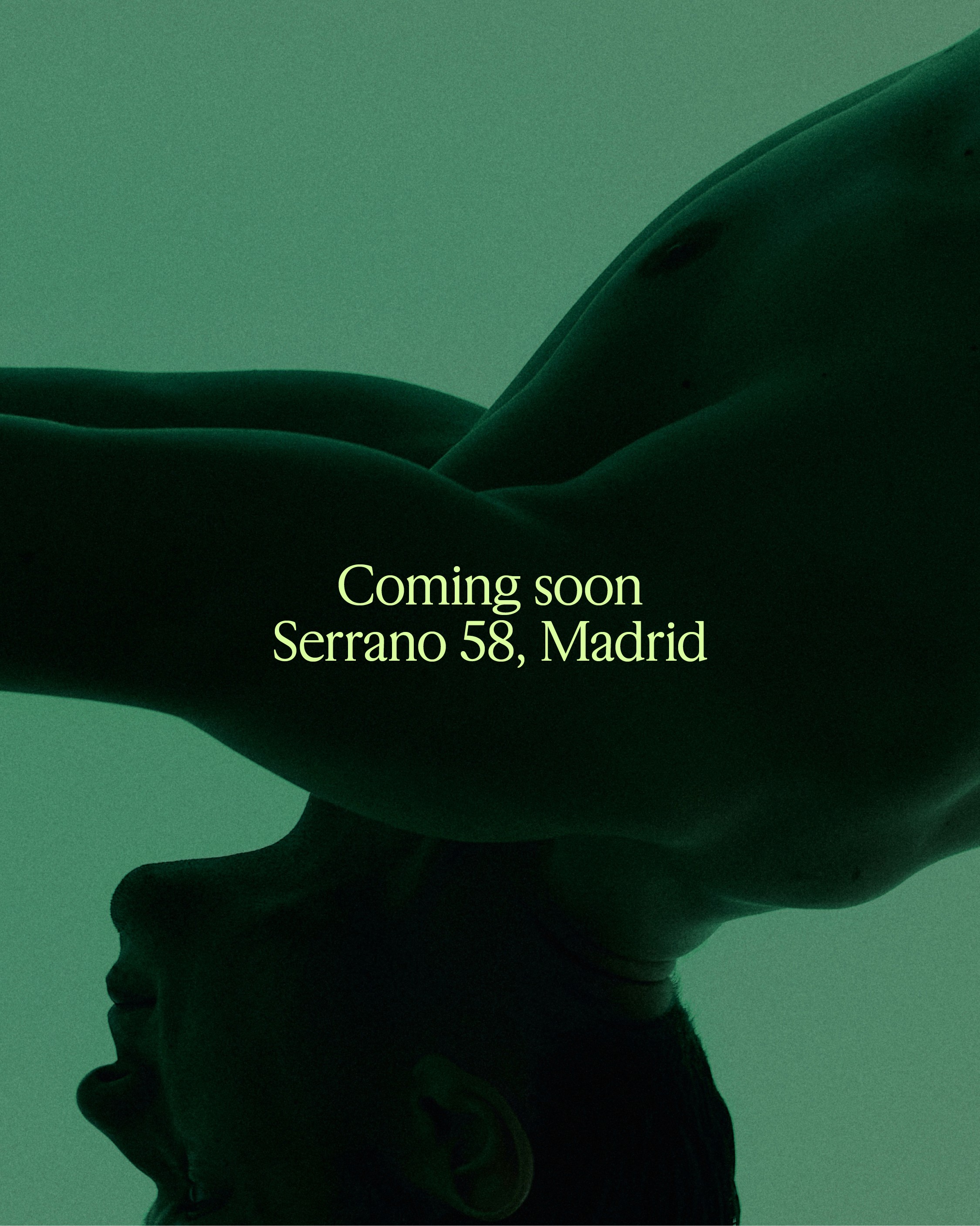
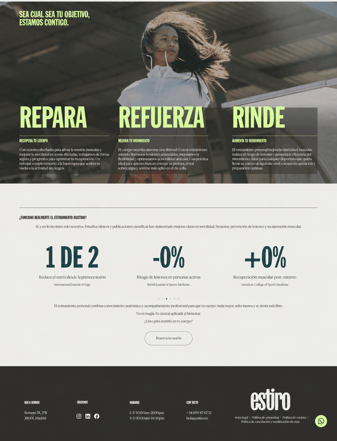
I also designed and built estiro.es. and @estiro_estudio. Today I run the brand's full marketing operation: strategy, social media, content creation, community management, digital advertising and merchandising. From the first sketch of the name to this month's ad performance — one continuous line of brand thinking.

The challege
Estiro launched into a category that barely existed in Spain: dedicated stretching and mobility studios. There was no established visual language to borrow from, no obvious reference, and a real risk of landing somewhere between a gym and a physio clinic. The brand needed an identity confident enough to define the category on its own terms — premium, contemporary, unmistakably its own — and a name that could carry it.




The approach
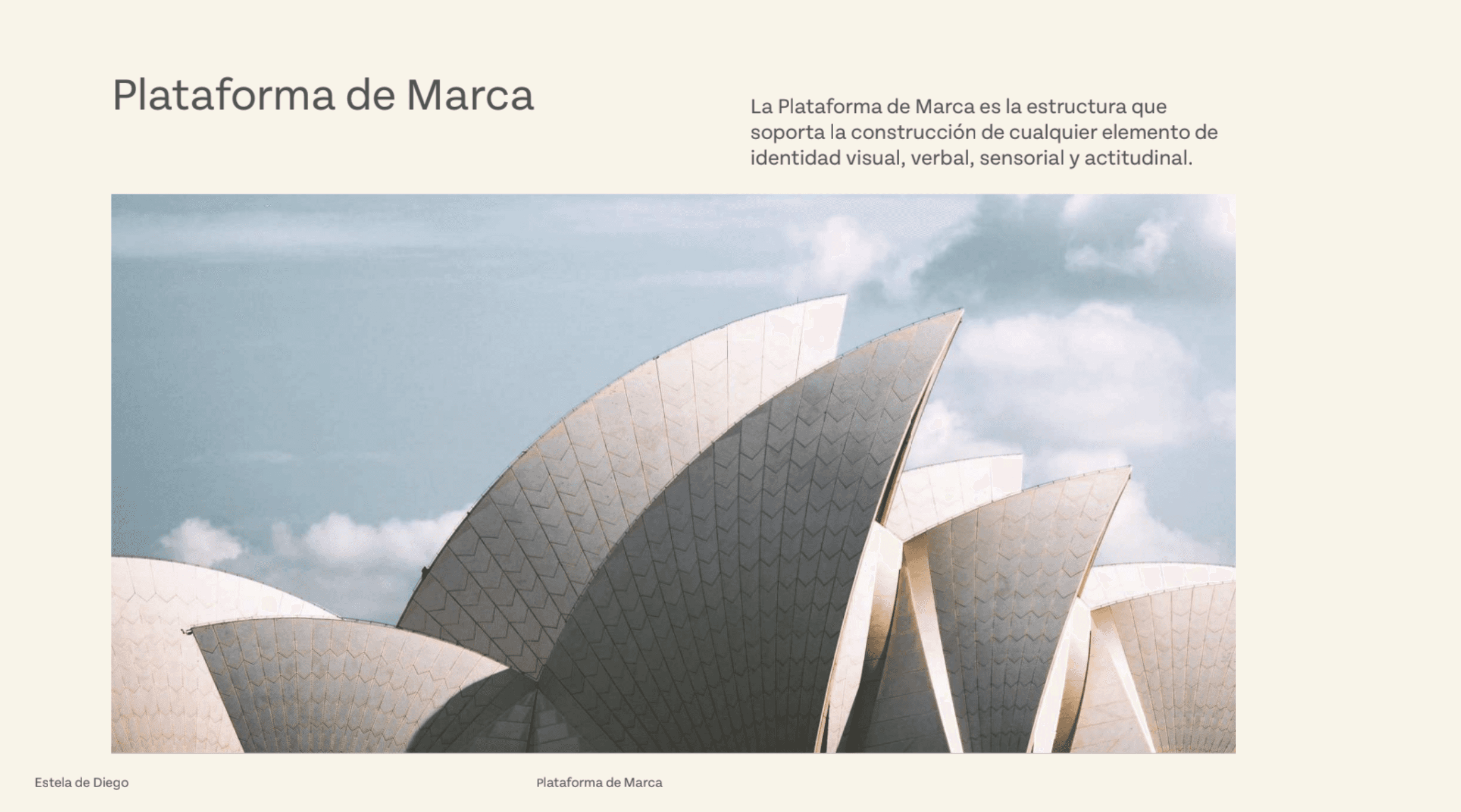
I built the foundation before a single pixel was designed: the name Estiro, the brand platform, and the core identity idea — fusing the t and the i into a single symbol. With that concept locked, I directed a graphic designer through execution and made the final calls on logotype and colour myself. From there the work never stopped at strategy: I designed and built the website and now run the entire marketing operation — social, content, community, paid media and merchandising — so the brand reads as one coherent voice from the name to this month's campaign.
Social



Website

Ads


